Basics of graphic drawing.
Types of graphic drawing
In a graphic drawing, especially a linear one, thin and wide lines are also used, but their main difference is that they “live” in drawings - they are drawn by hand, “build” volume, emphasize shadows, defining the border between light and dark. A line of the same length can have different thicknesses. Using lines, the number of plans in the drawings is indicated, and there are mainly three of them. I highlight the foreground closest to us, or rather, the objects in the foreground, using a thick line.
Using a linear drawing, you can depict people, animals, landscapes, or sketch a costume. Linear drawing uses only lines of varying thickness. Light-air media are transmitted using solid, intermittent and smooth lines of varying thickness. Additionally, a stroke or spot can be used to enhance expressiveness. The linear pattern is distinguished by the transition of lines into thick spots, characteristic of the art of Japan and China. It can be done with charcoal, sauce, sanguine, soft graphite pencils! Linear drawing is especially appropriate in sketches and sketches.
In addition to the linear graphic design, one should include planar decorative (made with spots of any tone) and light-shadow volumetric (also made with the help of spots that build volume, or strokes of varying thickness). The decorative drawing is carried out sequentially, filling the stains with ink or gouache, as well as any soft materials! It is used in posters, in costume sketches, i.e. where graphic clarity is needed to identify a specific theme or form.
In a black and white drawing, the form is built using spots made with strokes, with a gradation from the darkest to the lightest.
The stroke technique has its own characteristics. The stroke is applied in the drawing in different directions, but preferably according to the shape of the objects, without violating the integrity of their perception, that is, the stroke should not “tear” or “split” the shape. The dashed lines can be located close to each other or far away, at any distance from one another, and the pressure of the pencil can be increased or decreased.
The black and white pattern is rich in all kinds of tone transitions; The richness of the pictorial techniques of such drawing attracted and continues to attract artists.
In addition to the linear graphic design, one should include planar decorative (made with spots of any tone) and light-shadow volumetric (also made with the help of spots that build volume, or strokes of varying thickness).
The decorative drawing is carried out sequentially, filling the stains with ink or gouache, as well as any soft materials! It is used in posters, in costume sketches, i.e. where graphic clarity is needed to identify a specific theme or form.
In a black and white drawing, the form is built using spots made with a stroke, with a gradation from the darkest to the lightest
The stroke technique has its own characteristics. The stroke is applied to the drawing in different directions, but preferably according to the shape of the objects, without violating the integrity of their perception, that is, the stroke should not “tear” or “split” the shape. The dashed lines can be located close to each other or far away, at any distance from one another, and the pressure of the pencil can be increased or decreased.
The black and white pattern is rich in all kinds of tone transitions; The wealth of pictorial techniques of such drawing attracted and continues to attract artists.
Techniques for drawing geometric bodies
When drawing the simplest objects, you need to train your hand and learn, firstly, to hold a pencil correctly and secondly, to correctly make strokes, simple and broken lines. Tonal solutions in the drawing
Working on a black and white drawing is inextricably linked with finding the right tonal solution. Even when depicting single-color plasters, we observe differences between several light penumbra and the darkness of surrounding objects. The same objects placed in the light and against the light have a different tone. By tone we mean aperture ratio.
A pencil on paper cannot convey the bright light of the sun on a white wall and deep shadows on black velvet. In drawing, smaller contrasts are possible than in nature. For the truthfulness of the image, it is necessary to correctly maintain the sequence of relationships of all tonalities of nature from the darkest to the lightest. Tones are conveyed by a variety of gray shades, intermediate between the tone of paper and the tone of a pencil.
Using closer tonal relationships to depict sharper contrasts in nature, you can show the sparkle of snow and the depth of shadows. Tones also change depending on the distance to the subject of the image: when moving away, they lose contrast, shadows seem lighter, bright light dimmer. This is due to insufficient air transparency.
The concept of “tone” means the transmission in a drawing not only of chiaroscuro, but also of differences in the color of objects in terms of lightness. Any mistake in tone disrupts spatial plans.
When making a tonal decision, you cannot compare the tone of any one place in the drawing with the tone of the same part of nature (such drawing “point-blank” can give rise to many errors), it is necessary to analyze several tones at once, i.e. create certain relationships between tones as in nature, so in the drawing. This helps convey the tonal scale correctly.
The distribution of light and shade on the surface of objects is conveyed using tonal transitions from light to dark: glare, light, penumbra, self-shadow, falling shadow, reflex. The lightest spot or stripe on an object is called a highlight. This is the reflection of a light source on the polished or glossy surface of an object. It differs from light in its greater lightness.
The light evenly passes into penumbra and, condensing, turns into a shadow that is located on the object. There is also a falling shadow that is cast by an object on the plane of a table, board, wall, etc. The size of the falling shadow depends on the light source, its distance to the ground or to the plane on which the object stands. Many have noticed that objects, trees, buildings that are illuminated by the sun in different times years or even days, cast their shadows differently. In winter, when the sun illuminates the trees, the houses are somewhat to the side, the shadows from the trees are long, and in the summer, when the sun is at its zenith, the shadows are short.
If objects have different textures of material, then the color tone will also be very different when comparing them. When drawing objects with different tones, it is not necessary to take black as black; it is important to observe the conventional tonal relationships taken one to another. When outlining a shadow, you need to remember that even in this case the paper should shine through, and try not to darken the drawing too much, that is, do not make the shadow black, but only darker in tone.
Checking the drawing for accuracy
While drawing, the student must constantly check his work: the correctness of the layout, the design of the construction of objects, the observance of proportions between nature and the image. In addition to the fact that the drawing during work must be set aside for checking at a distance equal to approximately three parts of the length of the size of the nature, it can be directly placed next to the nature itself and checked, comparing with nature, from the place from which the drawing began. The drawing is set aside in any direction, as long as it
To check the correctness of the drawing in another way, you can take a mirror and, placing the drawing parallel to its plane, look at your work - in the mirror you will get the opposite image, and the slightest mistakes will be clearly visible.
 Drawing geometric solids and plaster vase
Drawing a cylinder standing on a horizontal plane 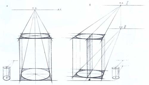
Drawing a cylinder begins with the bottom base lying on the plane of the table. Since it represents an ellipse, compare the dimensions of the major and minor axes. When drawing a lying lower ellipse, it is necessary to depict it with smooth transitions. The perpendiculars of the ellipse are restored to the major axis and the height of the cylinder is noted. The upper base of the cylinder is also an ellipse, but its dimensions are reduced compared to the lower one, so it approaches the horizon line and turns into lines on it. The volumetric shape of the cylinder is emphasized by shading along the shapes, separating the falling shadows from the object. Drawing a cylinder lying on a horizontal plane
A cylinder lying on a plane can be positioned strictly frontally to the person drawing or at a random viewing angle; the frontal position is simpler, so let’s take a closer look at the position at a random viewing angle. The instability of the cylinder in this position is easily explained: it lies on the table with a round cylindrical surface, in contact with it, and it rests on one straight line - the generatrix. The cylinder is built on the basis of a rectangular prism into which it can be inscribed. The side of the base will be equal vertically to the diameter of the circle of the base of the cylinder. Having constructed the axes of symmetry, the ellipses of the bases are drawn and the cylinder is finally constructed. The stroke emphasizes the shape of the cylinder and the falling shadows.
Drawing a group of geometric solids
The first stage is to find the most successful arrangement of a group of objects on the sheet, that is, the ratio of the width and height of the entire group at once, and then each object; separately. When outlining the basic proportions of the overall composition, it is necessary to include falling shadows and the remaining voids of the sheet.
The entire drawing is done with light lines, using auxiliary lines to construct objects on a plane and in perspective. They draw as if all objects are shining through one another. In a production, one object can cover another in different ways, so it is necessary to find an expressive turn from one object to another. Everyone decides the composition in their own way, with one or another subject being the main one. All transparent auxiliary faces are needed to check the position of objects in space. Having outlined the composition of the sheet, they designate the bases of objects that are located directly on the plane of the table.
The second stage includes constructive construction and elaboration of the shape of objects. The penumbra is applied with light shading; a darker tone is left for the shadows - their own and falling. To better identify white plaster, mark the background of the wall, board or table. The illuminated part of the plaster is left white, unshaded.
At the third stage of drawing, they continue to work on chiaroscuro, identifying all the halftones and reflections, generalizing, if possible, some parts. At the same time, you need to look in front of you in space at the entire production at once, covering more shadows, leaving in reserve the strength of tone for the final completion of the work.
The fourth stage is the generalization of the drawing, its final revision. At this stage, it is already difficult to correct anything in the constructive structure, therefore, they mainly check the strength of the tonal relationships of the drawing and staging, the subordination of minor details in tone to the whole, i.e. they work only with chiaroscuro. Since it is impossible to rebuild the design of objects again or correct their position in space and relative to each other, it is necessary to strictly observe the sequence of these four stages of drawing.
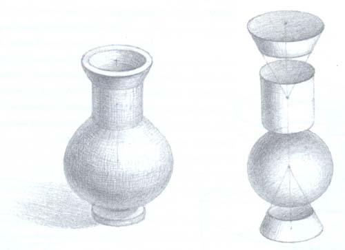
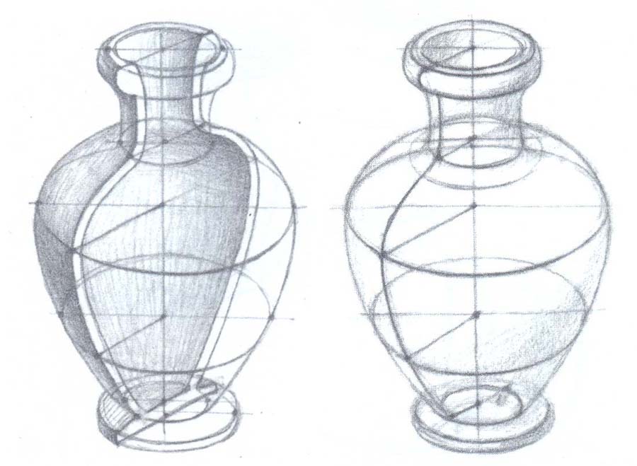
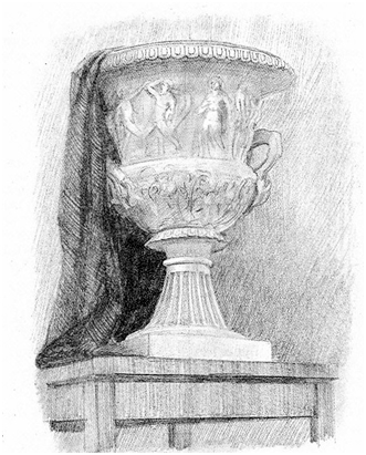
Compared to geometric bodies, a vase represents more complex shape, although it consists of relatively simple parts. Its middle part is the main one and is ovoid in shape, resembling a ball. The lower part - the stand - is two greatly shortened cylinders, the lower one being cone-shaped. The upper part of the vase is relatively low, in the form of a truncated cone, to which a plate-like shape is attached on top. Conveying all these proportional relationships is the main task of the drawing.
When drawing a vase, the principle of symmetrical construction is applied. The vertical axis of symmetry passes through the center of the vase, on which the height is laid out in the form of an arbitrary segment; a distance from the edge is left at the top that is smaller than at the bottom, in order to then draw the falling shadows on the table and the surface of the table.
Next, mark the horizon line, or the eye level of the person drawing (the person standing will have a higher eye level than the person sitting), and determine the ratio of the height of the vase to the width. To do this, from the central axis at the level of the widest point, the entire width of the vase is laid out in both directions in the form of equal segments. Having outlined the width at all levels, they begin to build the vase. It must be remembered that all cross sections of the vase are circles, and in perspective - ellipses.
At the level of the horizon line, an ellipse is depicted as a straight segment, below or above the horizon line - in the form of ellipses from narrow to circle when viewed from above or below. It is important to establish the dimensions of the ellipses in the drawing: if the vase is standing directly in front of us, the ellipse of the upper base will be narrower than the lower one. Having checked all the proportions again, they connect the segments, outlining the general shape of the vase.
After this, they move on to transferring volume with chiaroscuro. It should be remembered that any line in a cut-off drawing is the border between light and dark, that is, there should be practically no lines left in the finished drawing. All unlit areas are covered with a stroke, which is applied according to the shape, the falling shadows are outlined, while leaving the lightest and darkest places in the setting.
The final stage is the generalization of the drawing. Using a pencil and eraser, remove excessive detail, soften shadows, highlighting reflexes and illuminated areas. Reflex - reflected and therefore weakened light refers to the shadow and shows the nature of the surface of the form in its shadow part.
By drawing a vase, they consolidate their knowledge of perspective, learn to depict round objects, analyze any complex shape, and also combine different shapes into a single whole.
 Drawing draperies and folds on fabrics
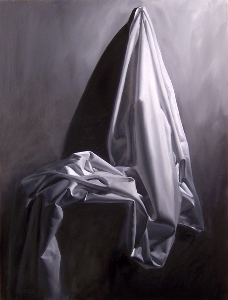
The fabric itself is a plane, a flat surface that has no shape. Only by hugging any object or human figure can it go down in the form of folds, turning either the front or the wrong side. Drawing helps to study the properties of fabrics.
Any fabric, depending on the lines and shapes that hold it at certain reference points, forms folds. More complex folds are usually called drapes. Folds and draperies can come in various forms.
The shape of the folds depends on what object it is thrown on, and the direction of the folds depends on these shapes.
The shape of the human body resembles in many ways geometric shapes- cylinder, ball. Before studying draperies on a human figure, you can examine them by throwing fabric over a ball, cylinder, cone, etc., determining the patterns of fold formation. In fabric thrown onto the surface of a table or chair, its plastic properties are clearly manifested. Crinkles, kinks and folds form, depending on the softness, fluidity or, conversely, the rigidity of the fabric, i.e. its structure. Thus, folds on gauze are very different from folds on velvet, brocade or cloth, as well as on silk or chintz. Comparison of two fabrics is possible based on the principle of contrast - light or heavy, matte or shiny, hard or soft, dense or sparse structure, etc.
Giving the fabric figurative and precise characteristics, it can not be called soft, flowing; hard, sticking out; heavy with large folds; light airy, transparent or elastic, flaccid, etc..
The drapery pattern is carried out in four steps:
1—we outline the composition of the drawing in the form of a sketch using thin threads.
2—we outline the main proportions of the entire mass of fabric, indicating major and minor folds.
3—Easily shade all darkened areas.
4—finishing the drawing, apply all the halftones, emphasizing the shadows and highlighting the main folds.
When drawing draperies, a fabric pattern (check, stripe, floral pattern, etc.) is depicted on the relief of the folds.
You can sketch and sketch fabrics (smooth and patterned) using various materials suitable for the selected fabric. Light, transparent fabrics can be depicted in watercolor, ink, pen, or charcoal; hard, sticking out - with ink, filling in the spots and emphasizing the kinks with a pen; soft, fleecy, heavy - sanguine, sauce, etc.
Scheme for constructing folds of various configurations:
We outline a rectangle, triangle or any other shape that this piece of fabric has;
we draw a line limiting the width of the fold at the bottom, the zigzag contour of the fabric bends, we draw the ratio of the height of the zigzag and the width of the fabric;
we build the contours of the bends of the folds, paying attention to parallelism individual elements zigzag and smooth curves of lines;
outline the vertical contours and the lower contour of the folds (the construction of the contours of the top should correspond to the construction of the contours of the bottom);
after drawing the contours, we conditionally determine the direction of the light falling on the folds of the fabric, and in accordance with this, we outline lighter and darker planes on the surface of the folds;
creating the illusion of volume with the help of light and shadow, we shade all the shadow areas.
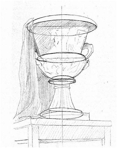
 Still life drawing
Still life from the French nature mort - dead nature. In contrast
drawing living nature, a still life is composed and depicted to study the properties of inanimate nature, the design features of individual objects, as well as to study the texture and plastic properties of various materials.
Still life appeared as an independent genre in art at the turn of the 16th–17th centuries. in Holland and Flanders and since then has been used by many artists to convey the direct connection of art with the life and everyday life of people.
The perception of a still life cannot be unambiguous.
Drawing up a still life requires the ability to depict the shape of various objects using chiaroscuro, perspective, and the laws of color.
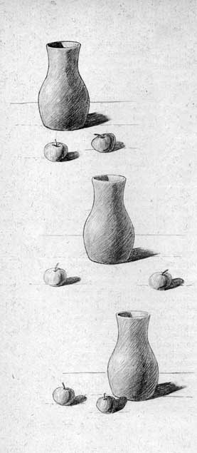
The basis for drawing up a still life is a selection of objects in which its general content and theme are most clearly expressed.
First, you need to draw a still life from two or three objects in order to better express all their plastic properties, choosing a certain point of view, i.e. horizon line.
One of the objects should become the compositional center of the production and stand out in size and tone. It should be placed closer to the middle of the production, and to add dynamism to the production (movement of spots) it can be moved to the right or left.
In the spatial solution of a still life, a small object that differs in texture and color from other objects can be placed in the foreground as an accent. To complete the composition, as well as to connect all the objects into a single whole, draperies are added to the production, thus also emphasizing the difference between solid objects and the soft flowing texture of the fabric. Fabric can
be smooth and patterned or patterned, but it should not distract attention from other, especially the main items. It is often placed diagonally to direct the viewer's gaze into depth, towards the compositional center for a better spatial solution.
Lighting—artificial or natural—plays an important role in the composition of a still life. The light can be lateral, directional or diffuse.
First, preliminary sketches are made on small-sized sheets of various shapes - square, elongated in height, laid horizontally. Having chosen the most successful of the sketches, you can proceed directly to drawing.
Having marked a still life on a sheet of paper, you need to follow the perspective construction, and also convey the volume using chiaroscuro, subordinating all the details to the overall tonal solution so that the result is not a set of individual objects, but a whole composition. It is important to learn to see this whole, and the details will be learned gradually as you work.
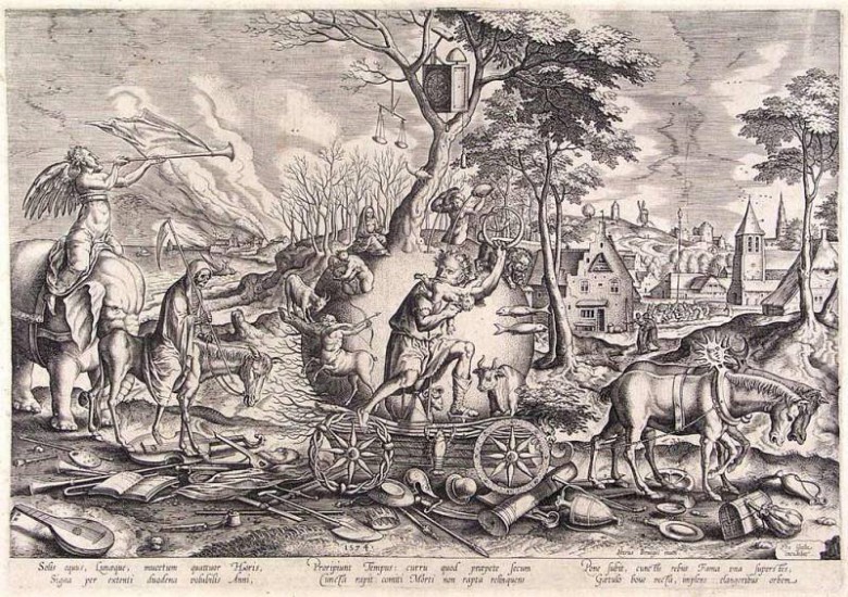
Even if the most famous paintings in our entire history are painted with paints, we should not forget about such an important component fine arts in human life, like graphics.
About the graphics in general
She has always been close to painting, appearing in individual works, along with paints and as a basis for their application. There are quite a lot of its types, well-known and not so well-known, and a large number of artists of all times and peoples turned to graphics in an effort to express themselves.
For graphics The main visual means are a variety of lines, dots, spots, strokes and tone, which together and even separately create a whole image. Color for this type of art is not the main thing, although it is quite acceptable. Usually, in addition to the main black, only one color is used in graphics, although sometimes (for example, in engravings) a fairly large variety of colors can be used. Due to the dominant color restraint, this type of art is sometimes also called black and white art..
Different types of graphics and her techniques appeared gradually, not all at once. The first images, as we remember from history lessons at school, are drawings on the walls of caves and stones that remained from primitive people. Then ornaments appeared on weapons, household items and tools that came from the Neolithic and Bronze Ages. At these early stages, art also combined the function of writing - the transmission of information. Parchment scrolls, stone slabs, and clay tablets used as a source of information have survived to this day. The ancient Egyptians succeeded in combining writing and graphics - they made full use of pictograms (drawings indicating various objects, actions and subjects) to display their history.
History of graphics
For a long period, graphics served only to decorate objects, easel graphics was not, and the connection with writing was preserved thanks to the decoration of books, like everything else at that time - only self made. China, for example, did not differentiate between drawing and calligraphy; they were considered equal and complementary. And in 868 AD There, a method was invented to increase the number of copies of a design using a cliche carved from wood. This was the beginning of woodcut - wood engraving, which appeared in Europe only in the first half of the 15th century. To this day, in Asia you can see craftsmen carving hieroglyphs or personalized seals on a wooden block.
Initially, graphics was only called writing, the art of fonts. Only at the turn of the 19th and 20th centuries did it take shape as an independent form of fine art. It is interesting to note that the modern museum classification also includes all techniques using paper and water-soluble paints (mainly watercolors, pastels and gouaches) as graphics. But here it all depends on what the artist is leaning towards - color or lines.
It is believed that graphics attract with their laconicism, severity and capacity of images, combined with some uncertainty and understatement, convention, which makes the viewer’s imagination work more actively. That's why artistic value like works of art, they also have sketches, sketches, sketches - seemingly unfinished paintings, but also independent paintings.
Magnificent examples of graphics can be seen in Leonardo da Vinci, Michelangelo Buonarroti, Albrecht Durer, Rembrandt van Rhein, Ivan Shishkin, Taras Shevchenko and many, many other artists also known for their painting.
Traditional basis for graphic drawings there was and remains paper - most often white, but, depending on the artist’s idea, also colored, sometimes black or textured. Such a background seems to create its own space in which the depicted “lives” - two-dimensional or three-dimensional only thanks to the imagination and skill of the author. But, for example, the portrait of Chaliapin by Serov’s hand was created with charcoal on canvas, and primitive graphics have come down to us on stone, so there are no special restrictions. You can, however, add polymer films and foil as a basis for drawing materials.
![]()
The traditional tools of a graphic artist include a graphite pencil, a ballpoint pen, charcoal, and others like them. But for some types of graphics you need printing presses, wood/linoleum cutters, lithographic stones - something that is not found everywhere.
In general, various pencils, brushes, steel, goose and reed feathers, wooden, glass and reed sticks, fountain pens and felt-tip pens, tubes are used different forms(glass or metal), spray guns, airbrushes, as well as all the variety of shading, tampons and rollers. What do these tools do? Watercolor, ink, ink, gouache, tempera, printing, oil and synthetic paints, various varnishes, textile dyes. In addition to these materials, charcoal, pencils in sticks and powder, and pastels are also used.
Types of graphics
The types of graphics are varied. It is traditionally divided into easel (like painting), book (illustrations and other publication design) and newspaper and magazine (drawings, cartoons) and applied graphics (stamps, labels, envelope design, posters, posters and much more). The youngest type is computer graphics, but it is not directly related to the materials that other types use, and therefore stands aside.
All genres are used in graphics– after all, it allows you to detail, blur, and hint at the object, and fully convey the world (especially in the popular genre of hyperrealism today). In addition, there are also different techniques. First of all, you need to name the drawing (it doesn’t matter what it is or what it’s on, even if it’s printed). Another option is a print – an author’s drawing intended for reproduction, that is, printing. It includes engravings on wood (woodcut), metal, linoleum, cardboard, glass and stone (lithography).
As already mentioned, a certain time the term " graphics" meant only writing and calligraphy, but after the appearance of drawings in books, and after them the expansion of drawings beyond the boundaries of books, the area covered by the term expanded. With the development of industry, the increase in education and the number of printed publications (both books and periodicals), industrial printing also developed, spreading graphic drawing and helped in the development of graphics as an art.
At first, graphics were understood as the art of line based on the contrast between black and white, but over time this understanding expanded, adding concepts such as stroke, spot, dot, tone to the definition. Today, the development of graphics does not stop, as does the development of painting in general. New genres, techniques and, of course, new works in these styles are appearing, which we will talk about in the next article.
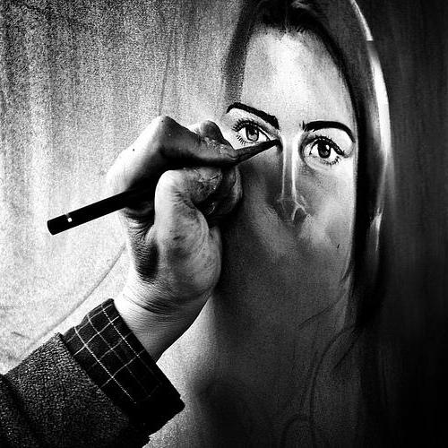
Many aspiring artists dream of learning how to draw portraits with a pencil. This is completely new level in creativity. Having learned to draw a portrait of a person, you can easily master the watercolor technique, paint with sanguine and charcoal, as well as oil. You definitely need to start with. By confidently manipulating graphic materials, you can achieve incredible resemblance to nature.
How to draw a graphic portrait
To draw it you will need:
- A tablet covered with whatman paper.
- Measuring device (ruler).
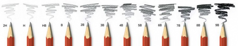
- Simple pencils of varying hardness.
- Eraser.
To portray quality graphic portrait, try to reduce the use of the eraser to a minimum, as it rubs the paper, causing dirt to form on the drawing. After the materials are prepared and the sheet is stretched, we can begin to work.
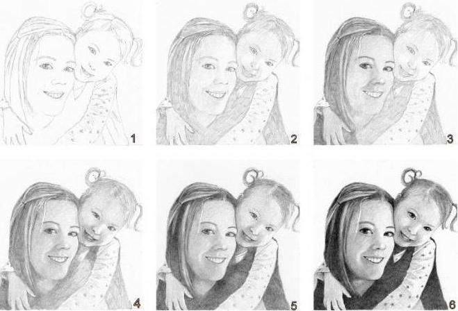
Drawing a portrait
We analyze our nature, carefully study it from each side in order to understand its features and form. It is advisable to make preliminary constructive sketches in order to understand the shapes and understand them. The nature needs to be drawn from each side, this will allow you to understand its shape, study its features and each detail separately. 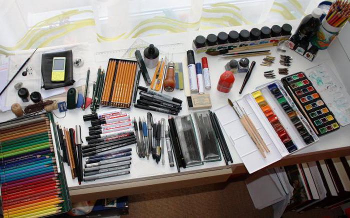
How to draw a graphic portrait step by step
We settle down on the spot best review, preparing materials. Nature must be static. Let's start drawing a graphic portrait step by step:
- First you need to make a layout on the sheet.
- We outline the individual parts of the image in general terms.
- We find the rotation and construction axes.
- We begin to build a shape, alternating from general to small details.
- At each of the previous stages, it is necessary to carefully compare the image with nature, check for proportional relationships forms and future abbreviations.
- This stage is shading. After the construction is completed, you need to start applying strokes; you need to do this carefully and slowly, dividing the drawing into shadow and illuminated parts.
- We add a stroke to the shape, thereby adding volume to the portrait, but don’t forget about the generality and get hung up on one particular detail.
To make pencil portraits work, you need to analyze and understand your mistakes. Usually, beginning artists put too much pressure on the pencil due to inexperience. Because of this, the work turns out to be redrawn, that is, the lines are too sharp. The drawing should not be outlined with a black line; it should fit harmoniously into the format and convey the shapes.
Common mistakes
In trying to convey volumes, the artist gets too carried away with small details and works hard on them. As a result, the image ceases to be holistic. Even a novice artist notices this himself.
Sometimes the problem is that the artist cannot understand how the details he is trying to work out work. As a result, it is impossible to detail the image, hence the fragmentation in the drawing, and a violation of perspective relationships is also possible; many try to make the work holistic, at least through tonal elaboration. Working on a certain detail and making mistakes in it, the draftsman tries to connect it with the overall shape, applying layers of graphite one after another. And in the end he remains disappointed with the result. But to draw a high-quality portrait of a person, it is enough to study every detail well.
Analysis of shortcomings
If the artist is faced with the problems described above, then he needs to take into account the following: after constructive analysis, the forms with the help of shading have begun, and at this stage, certain doubts often begin to bother him about continuing to work on the image.
Stop analyzing tones and repeat analyzing shapes. Go over the shape with a pencil, disassemble the nature on a plane and remember its design. After such a detailed analysis, drawing becomes much easier.
Imagine in your mind which part comes from where, how the volume is formed and why this happens. This mental process helps to understand how to distribute the light and shade, what area will be immersed in the shadow, where the penumbra is located and where the light falls. 
We eliminate the shortcomings step by step
If you encounter difficulties in working with the form, you should proceed as follows:
- We visually divide the form into several planes that create its volume.
- We analyze how the form is structured, then we build it using conventional planes or using construction lines; you can combine all methods together.
- If none of the methods helped, you need to summarize the drawing. It is necessary to collect all the small details together using conditional planes.
How to improve a skill
In order for your hand and eye to get used to drawing, you need to make sketches every day, which help you understand nature and improve your skill. Try to capture the volumes of nature, as well as planes and proportions. Make sketches from life regularly. You can watch TV and try to capture the pictures you see on the screen. Keep a pen and sketchbook handy at all times. Draw everything you see, take the necessary equipment and make sketches in the subway and at train stations, where there are huge crowds of people. Train the skill every day, compare ratios and volumes. To do this, you can use photographs or drawings from books. Learn to focus your attention on general forms and don't get hung up on the little things. This is the only way to improve your skills.
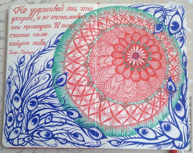
Zentangle & Doodling / Zentangle and Doodling. Step by step drawingYou will need paper, a simple pencil and an eraser, capillary pens different colors, and... the desire to draw, of course.
Initially there is no special concept in my drawings. I start drawing abstract lines and shapes, and then in the process of drawing the overall picture emerges.
This drawing technique is known as Zentangle & Doodling / Zentangle and Doodling.
Zentangle is a new, emerging art form that combines creativity, meditation and pleasure. Almost anyone can enjoy drawing intricate designs using the easy-to-learn Zentangle method. You don't need to be an artist or purchase expensive materials and equipment; all you need is paper, a pen (liner) and a pencil. Zentangle allows you to relax and reduce stress while you create something beautiful.
Doodle (translated as “doodle”) is a focused drawing made while a person’s attention is occupied with something else. Doodles are simple drawings that can have specific representational meanings or can simply be an abstract form.
Zendoodling is a hybrid of Zentangle art with Doodling. Zendoodles are often free-form and have an abstract appearance, sometimes with splashes of color.
That's how confusing everything is.
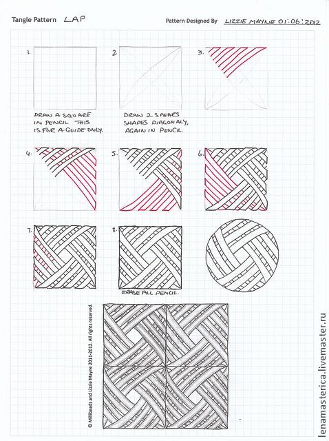
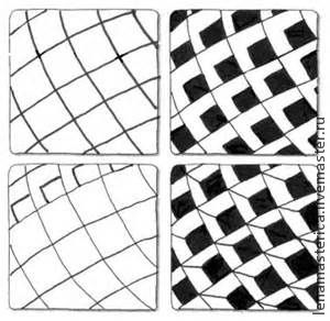
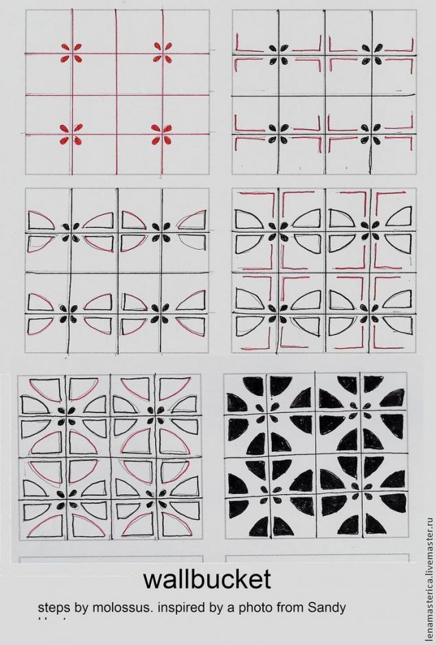
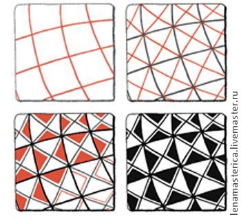
Here are some drawing patterns that you can apply to your drawings in different shapes and interpretations to create your own unique drawing:
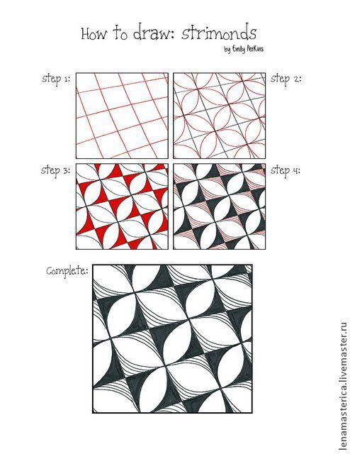
Well, now - my processes! I started drawing this drawing from the bottom left corner:
.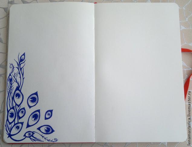
Then I wanted circles. It is easier to use a compass in this situation. But, since I didn’t have one, I simply circled containers of different diameters with a pencil. Using a ruler and pencil, I divided the circles into sections, so it’s easier to fill them with patterns.
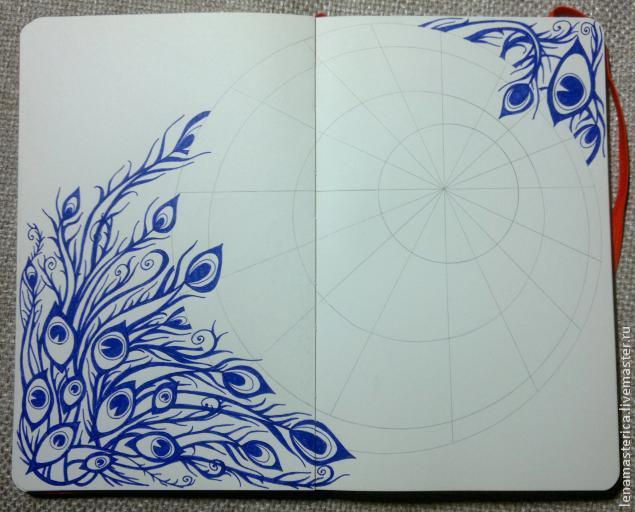
When all the boundaries have been marked with a pencil, you can begin to fill the sections of the circle with various patterns. Started from the center.
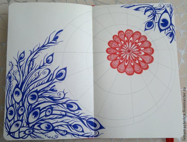
I continue to fill the sections with different patterns.
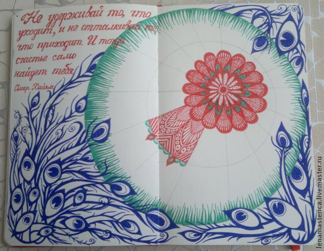
The question of which patterns to fill in the next sections does not even arise; just start, the pen will draw on its own, as this is a very exciting process!
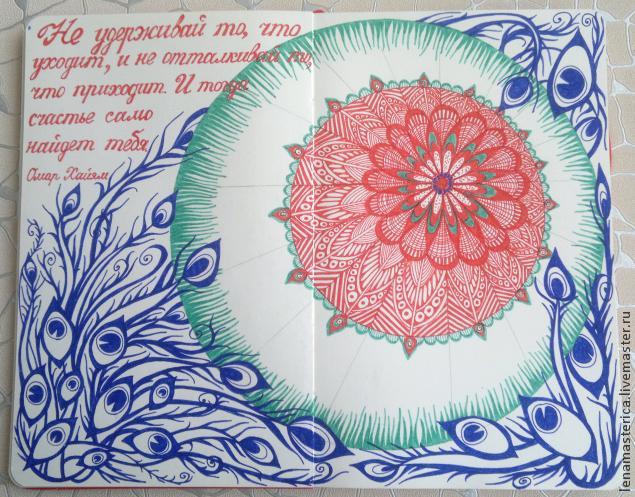
We are nearing completion, filling the last sections of the circle with patterns.
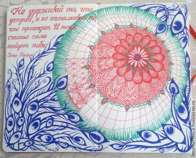
When finished, use an eraser to carefully erase the pencil lines so that the work looks neat. Ready!
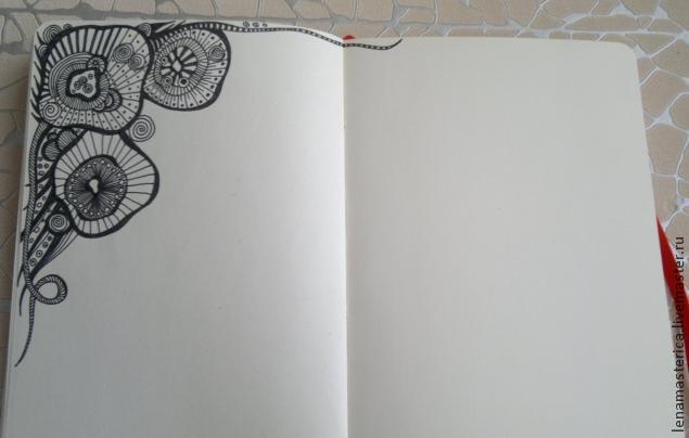
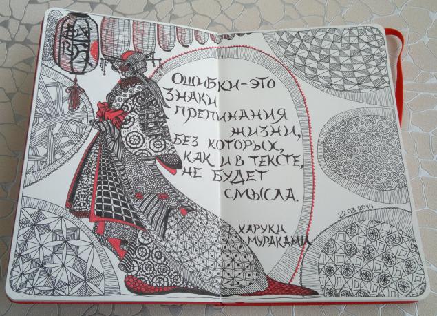
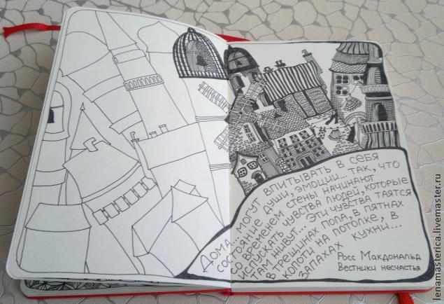
Of course, it is not necessary to include text in the pictures, but I was thinking of something like a book with interesting thoughts in pictures. Here are some more pages from it (and the drawing process):
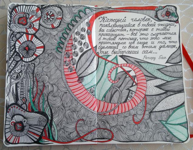
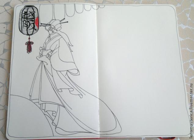
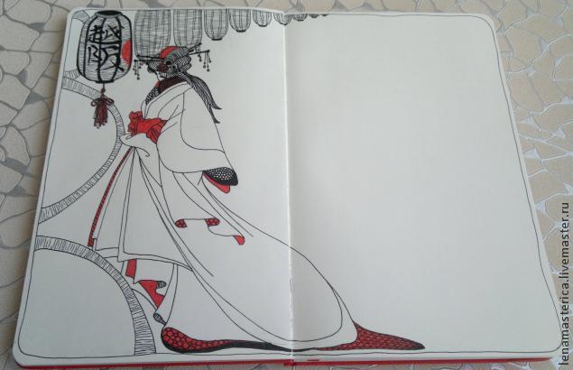
In this work I started from the top corner. Abstract figures are drawn and filled with dots, lines, etc. all with the same capillary pens.
![]()
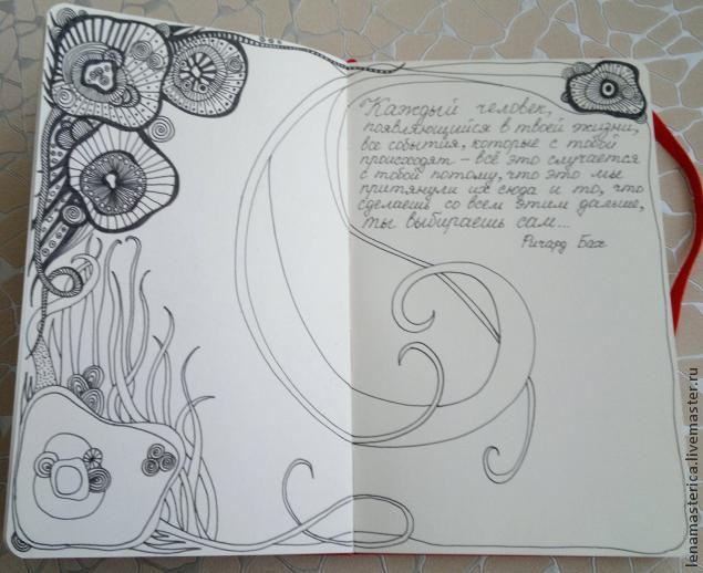
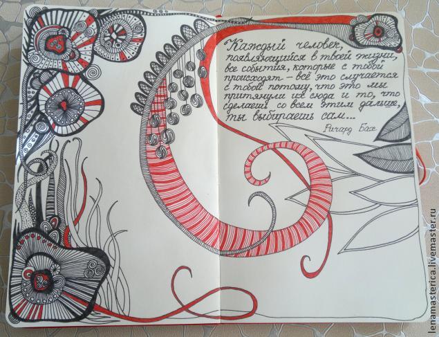
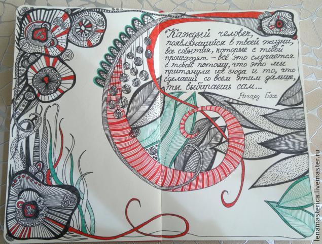
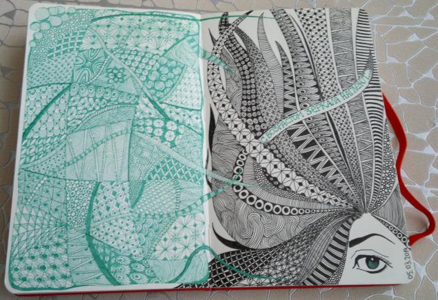
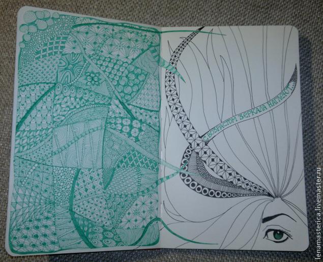
We complement the drawing with color accents.
This design with a Japanese twist is drawn with finer gel pens.
I started with a sketch:
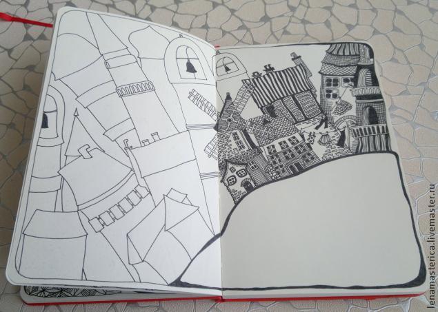
And again - capillary pens. Houses.
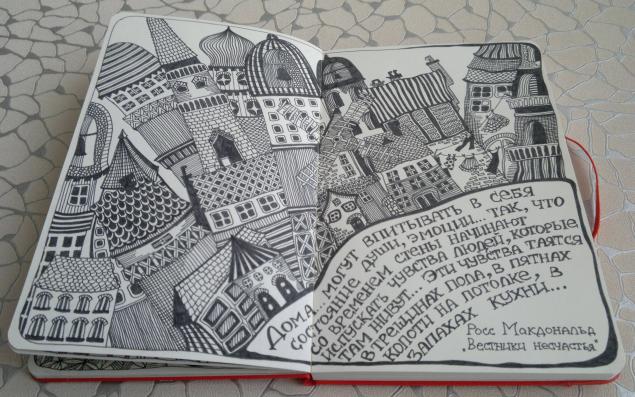
We act according to the above principle, first - the figures and the general plan, then - filling the figures with abstract patterns.
A green capillary pen and a black gel pen are used here. The principle is still the same, shapes and patterned filling.
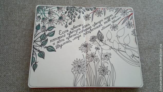
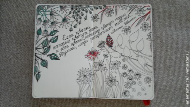
I wanted flowers :)
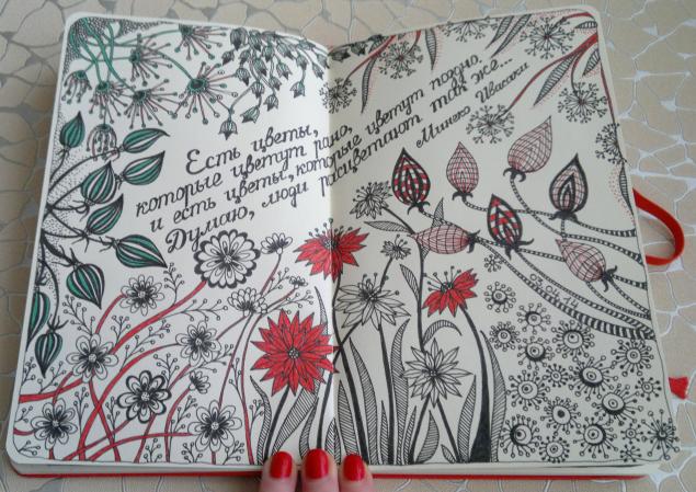
I drew fantasy flowers from all angles, which seem to tend to the middle, and filled them with various patterns, using multi-colored pens.
I hope it was interesting.
Have a nice day and good mood!
Best regards, Elena